Pioneering
Creative
Excellence
Script Orbit
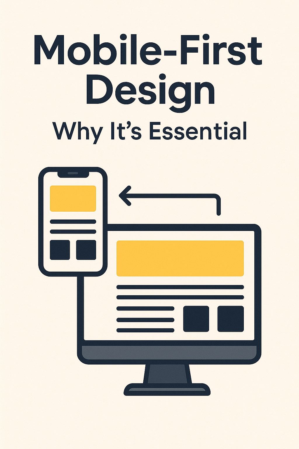
Mobile-First Design: Why It’s Essential
Estimated Reading Time: 7 minutes
In today's fast-paced digital landscape, your website's performance on mobile devices can make or break your online presence. With more than half of global web traffic originating from smartphones and tablets, adopting a mobile-first design approach is not just beneficial—it's essential. Whether you're managing a local Toronto-based small business or aiming to connect with a global audience, prioritizing mobile design can significantly enhance user experience and improve your business outcomes.
Let's explore why mobile-first design matters and how you can effectively implement it to benefit your business.
Understanding Mobile-First Design

Mobile-first design involves creating and optimizing your website primarily for mobile devices and then scaling up for larger screens like desktops and laptops. This approach ensures your website delivers exceptional user experiences on smaller screens before expanding its features and layouts for larger ones. Why Mobile-First Matters
- Growing Mobile Usage: Mobile device usage continues to surpass desktop browsing worldwide.
- SEO Benefits: Google prioritizes mobile-optimized websites, significantly impacting search engine rankings.
- Enhanced User Experience: Improved navigation and faster load times increase user satisfaction and conversion rates.
Key Benefits of Mobile-First Design
1. Improved User Experience (UX)
Optimizing for mobile ensures visitors have smooth, intuitive interactions with your website, reducing bounce rates and boosting conversions.
- Simplified Navigation: Clear, intuitive menus help visitors quickly find information.
- Streamlined Content: Concise, mobile-optimized content increases readability and user engagement.
2. Enhanced SEO Performance
Mobile-first indexing by search engines means mobile-optimized websites rank higher, helping you reach broader audiences.
- Higher Search Rankings: Improved visibility on search engines.
- Increased Organic Traffic: Attract more visitors naturally, without additional advertising costs.
3. Faster Load Times
Mobile optimization reduces page load times significantly, a critical factor in user retention and SEO ranking.
- Reduced Bounce Rate: Visitors remain on your website longer, enhancing conversion opportunities.
- Improved Google Rankings: Page speed directly influences search rankings.
Essential Elements of Effective Mobile-First Design
1. Responsive Web Design
Responsive web design ensures your website adapts fluidly across different screen sizes.
- Adaptive Layouts: Automatically adjust to various devices and screen sizes.
- Consistency Across Devices: Maintain consistent branding and user experiences on all platforms.
2. Optimized Images and Media
Optimizing media for mobile ensures quick loading and enhances visual appeal.
- Compressed Images: Use properly optimized images for fast loading.
- Adaptive Media: Implement responsive media queries for seamless display.
3. Touch-Friendly Design
Mobile users navigate using touch gestures. Your design must accommodate these interactions.
- Larger Buttons: Easily tappable buttons reduce frustration.
- Adequate Spacing: Proper spacing between interactive elements enhances usability.
4. Minimalistic and Clear Content
Focus on delivering concise, impactful content optimized for smaller screens.
- Clear and Concise Copy: Short, engaging content to convey messages effectively.
- Strategically Placed CTAs: Clear calls-to-action to guide user interactions.
5. Mobile-Friendly Navigation
Implement intuitive navigation menus tailored for mobile browsing.
- Simplified Menus: Compact and accessible menus improve the user journey.
- Visible Search Functionality: Easy-to-find search bars enable quick information retrieval.
Real-World Applications: Mobile-First in Business
E-Commerce Development
Platforms like Shopify thrive with mobile-first strategies:
- Mobile-Optimized Checkouts: Simplified checkout processes boost conversions.
- Personalized Mobile Shopping: Enhance user engagement through tailored mobile experiences.
WordPress Development Toronto
Toronto-based businesses using WordPress benefit from:
- Responsive Themes: Effective mobile-first themes available on WordPress.
- SEO Advantages: Local businesses can dominate local search results with optimized mobile websites.
Progressive Web Apps (PWA) Development
PWAs are a powerful extension of mobile-first design:
- Offline Accessibility: Users access your site without internet connectivity.
- Enhanced Engagement: Instant updates and push notifications retain user interest.
Implementing a Mobile-First Strategy for Your Business
- Audit Your Current Website: Identify areas that require mobile optimization.
- Prioritize Mobile User Experience: Implement design adjustments to streamline mobile browsing.
- Optimize for SEO: Align your mobile strategy with SEO best practices for maximum visibility.
- Test Across Devices: Regularly test your site’s performance on various mobile devices and platforms.
Why Choose ScriptOrbit for Your Mobile-First Web Development?
At ScriptOrbit, we deliver tailored solutions to elevate your mobile presence:
- Responsive Web Design
- Custom Web Development • SEO Services Toronto
- E-Commerce Development
- Progressive Web Apps (PWA) Development
- UX/UI Design Agency Services
- Digital Marketing & Web Design
Our skilled professionals ensure your website meets and exceeds the demands of mobile-first users, whether you’re a local Toronto small business or a global enterprise.
Ready to Optimize Your Mobile Presence?
Enhance your online visibility, boost engagement, and improve conversions through strategic mobile-first design.
Contact ScriptOrbit today to revolutionize your mobile website experience!
"Creativity is intelligence having fun." - Albert Einstein